
Executive Summary
I was 26 when I first learned the word "trebuchet" — a medieval catapult, and also the font a client insisted on using across their entire website. That summer taught me how much a single font choice, paired with the right hex code of blue, can quietly build a brand's whole personality.
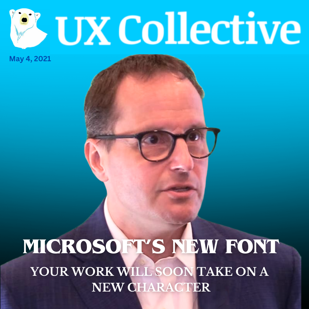
So when Microsoft announced they were retiring Calibri as Office's default font in 2021, after Calibri itself had replaced Times New Roman back in 2007, I knew it mattered more than it looked. Five finalists were in the running — Bierstadt, Grandview, Seaford, Skeena, Tenorite — each designed around a different idea of what "authority" should feel like on a page. Grandview's designer pulled from German industrial road signage. Seaford's team looked at old armchairs, aiming for "durable upholstery, nothing overtly plushy."
Whichever one won, it was going to become the invisible backdrop of millions of emails, memos, and pitch decks — proof that the most powerful design decisions are often the ones nobody consciously notices they're reacting to.
Related Content